


Heading 1
Heading 2
Heading 3
Heading 4
Heading 5
Heading 6
This is the Simple Content Layout.
You can do a lot with it,
Like move text around.
- Add
- Bulleted
- Lists
- Numbered
- Lists
And even quotes
-Taylor
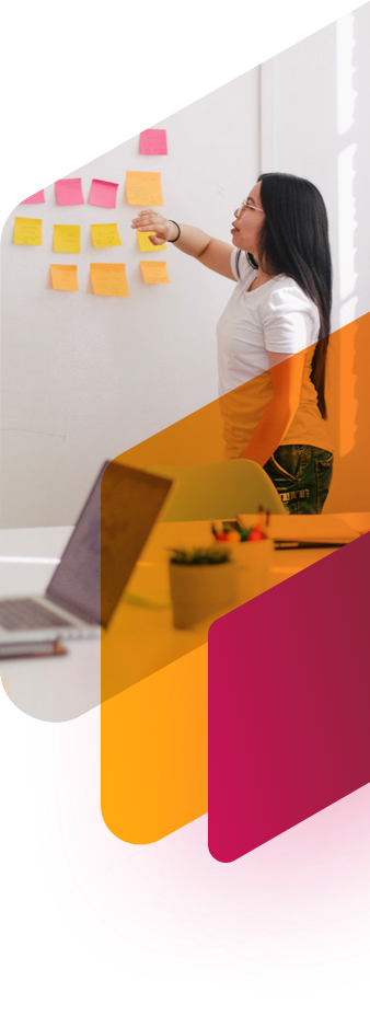
This is the Home Header with Panel Image section. You can add buttons below, two images (one for the desktop breakpoint and one for the image breakpoint), and decide on whether or not to include the diagonal background.


You can add list items here, and flip the content! Don’t forget to decide if you want this big shape on the upper left or not.
This is just one of three icons
This is just one of three icons
This is just one of three icons
This has some Twitter posts and beckons people to connect with out clients. Diagonal Background not required.
— Carolina Fintech Hub (@CarolinaFintech) May 28, 2019
This is similar to the last few callouts where you can decide if you wanna show the latest one or not. It's all up to you! Diagonal Background not required.
All Insights
Icon Card
This is one of the three icon grid cards
Icon Card
This is one of the three icon grid cards
Icon Card
This is one of the three icon grid cards
This is another Header that only consists of text and the shape right or the diagonal background.
This is the Content Callout section. You can add buttons below and show or hide shapes on either side.
This is the Focus Header with Buttons, made specifically for the Focus Area pages. This will be just text here, but you can add the buttons below and also add the diagonal background, shape left, and shape right.
This is one Icon card of four.
This is one Icon card of four.
This is one Icon card of four.
This is one Icon card of four.
This is the Simple Content Layout.
You can do a lot with it,
Like move text around.
And even quotes
-Taylor